liveplot
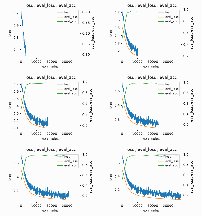
Live training curves in Jupyter, Colab and the VS Code / Cursor interactive window, with a tqdm bar underneath, at (almost) no cost to the training loop.



pip install git+https://github.com/ARENA-education/liveplot.git
from liveplot import LivePlot

plot = LivePlot(loader, "loss | acc", "lr")       # wrap the loop like tqdm; "|" puts acc on a right-hand axis
plot["acc"].set_ylim(0, 1)                         # configure like matplotlib
for batch in plot:
    loss, acc = train_step(batch)
    plot.log(loss=loss, acc=acc, lr=lr)            # log like wandb
It wraps iterables like tqdm, logs like wandb and is configured like matplotlib, so the names are ones you already know. Rendering happens in a separate process and the output is a plain image, so it behaves the same everywhere with no widgets or JavaScript, and interrupting a cell is safe.
Documentation: the guide (nested loops, the x-axis, reference lines, smoothing, recording GIFs), the API, and the examples. The tour in examples/demo.py runs cell by cell in the interactive window or in Colab.
MIT. Per-panel option names and the grid rule are adapted from Tyler Lum’s live_plotter; see THIRD_PARTY_LICENSES.md.